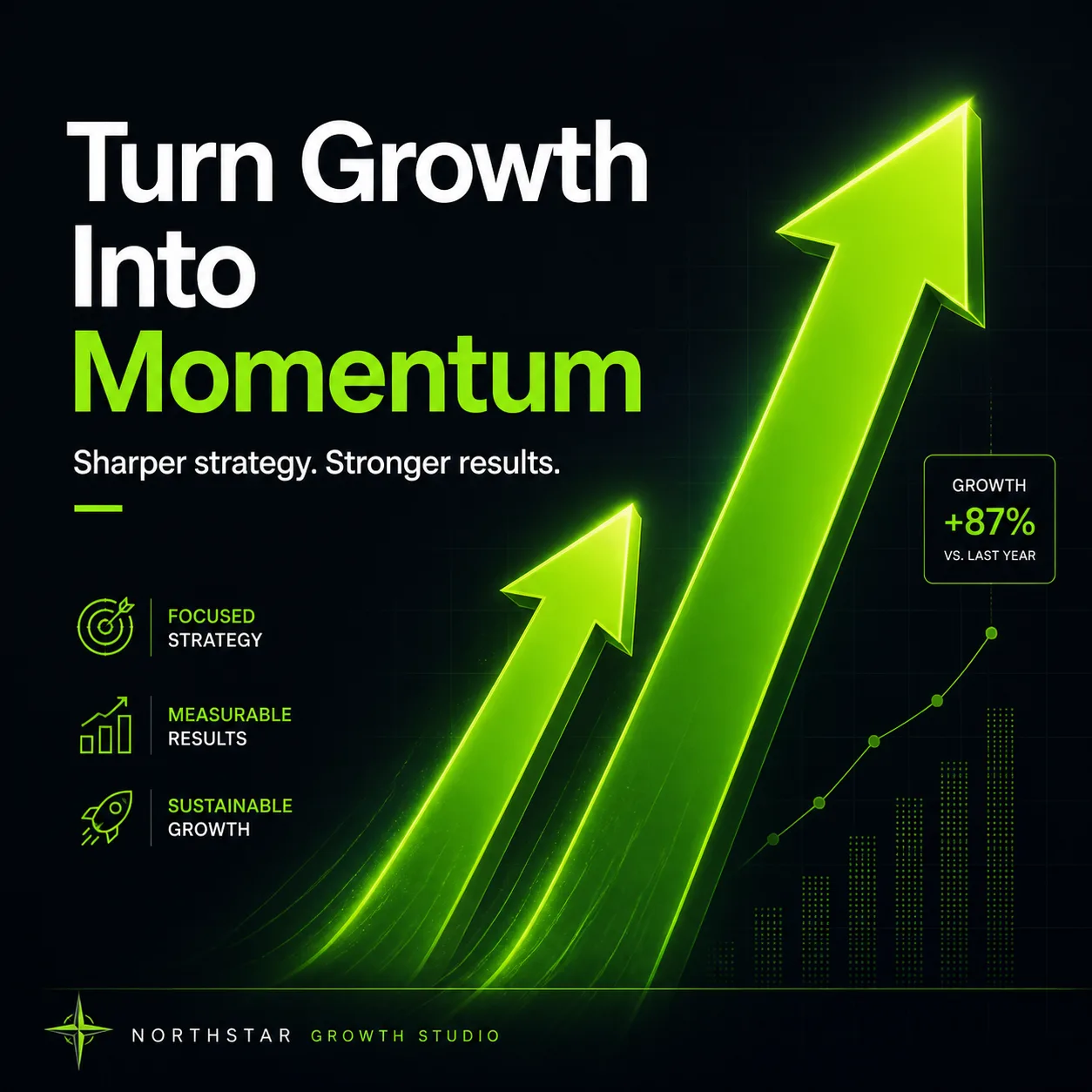
Two bold comparison arrows rise from the lower left toward the upper right, with the second arrow noticeably taller to communicate measurable growth. Use the Brand Color for the arrows, key accents, and small graphic highlights against the Background. Render the Headline exactly as written in large, clean sans-serif typography, with the Supporting Text beneath it in a smaller, balanced line. Place the Agency Name discreetly along the bottom edge. Keep the composition spacious and confident, with sharp geometric forms, subtle glow around the arrows, strong contrast, and a refined agency marketing aesthetic. Add faint grid lines and restrained data-inspired details without clutter. Ensure every word is spelled correctly and remains highly legible at a glance. Compose the design in the Format.

Use these details:
Brand Color: "electric green"
Background: "deep charcoal with a subtle black-to-navy gradient"
Headline: "Turn Growth Into Momentum"
Supporting Text: "Sharper strategy. Stronger results."
Agency Name: "Northstar Growth Studio"
Format: "1200 x 1200 square LinkedIn post"