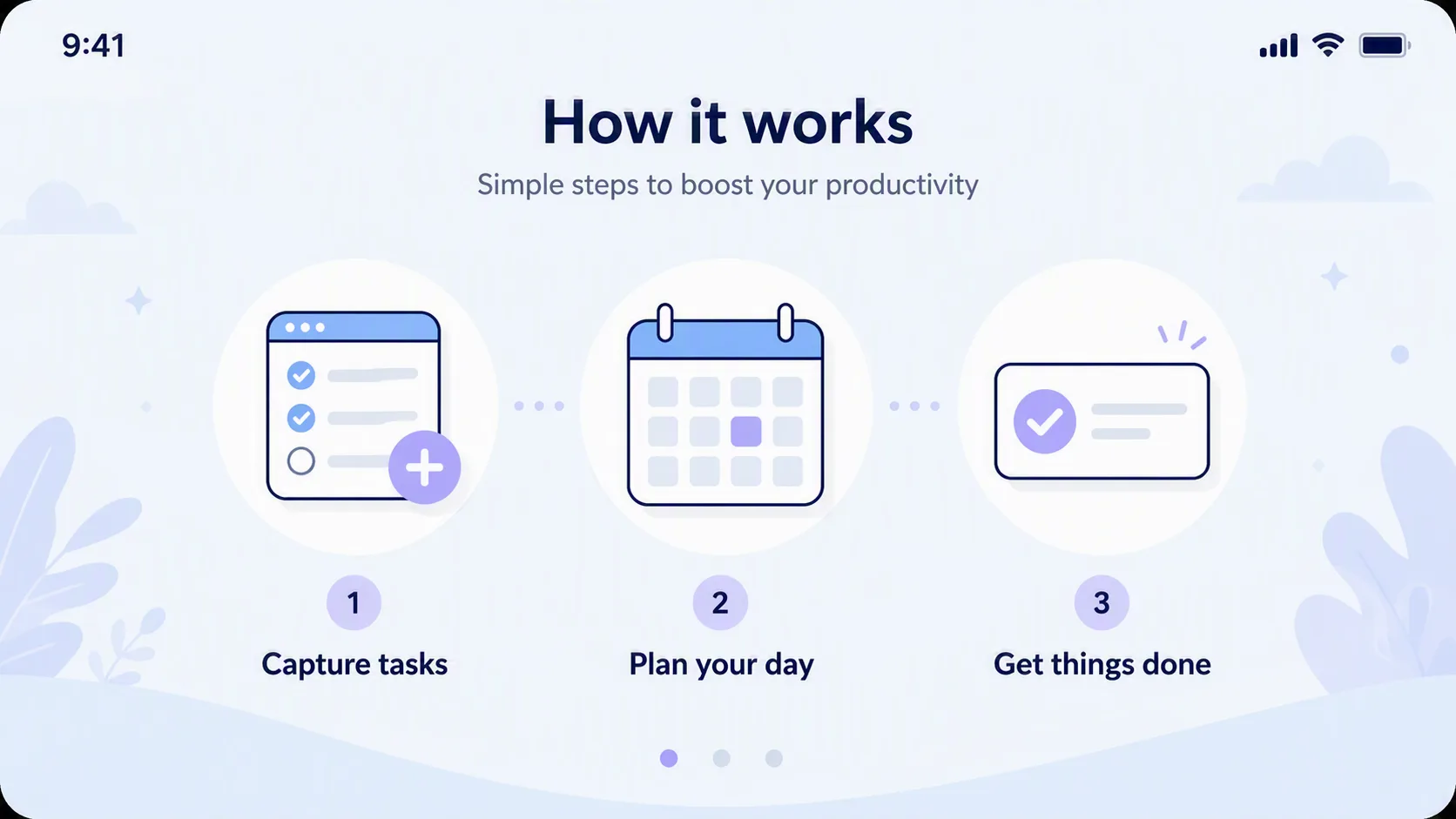
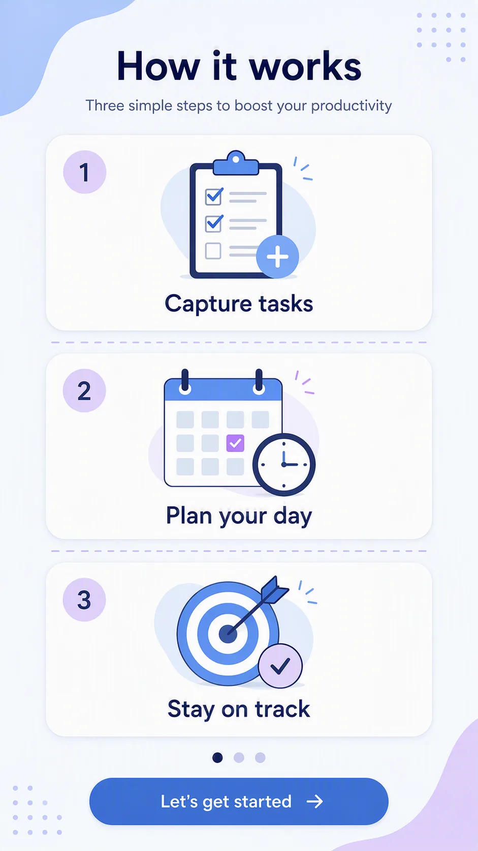
Arrange three friendly onboarding icons in a single evenly spaced row for a productivity app how-it-works screen. Pair each icon with the corresponding item from Step Labels and use the matching concept from Step Icon Concepts. Keep the reading order left to right, with consistent icon scale, generous spacing and clear visual hierarchy. Use the Color Palette across the background, icons, labels and subtle accents, keeping strong contrast for easy reading. Give the interface a light, approachable feel with rounded shapes, thin outlines and restrained shadows. Use a clean sans-serif typeface, centered labels and a small amount of supporting whitespace. Make the layout feel like a real mobile app onboarding screen rather than a generic poster, with crisp edges and accurate typography. Render the composition in the Format.

Use these details:
Step Labels: ["Capture tasks", "Plan your day", "Get things done"]
Step Icon Concepts: ["A checklist with a plus sign", "A calendar with a highlighted date", "A completed task with a checkmark"]
Color Palette: "pastel blue, white, soft navy and muted lavender"
Format: "16:9 landscape app screenshot"