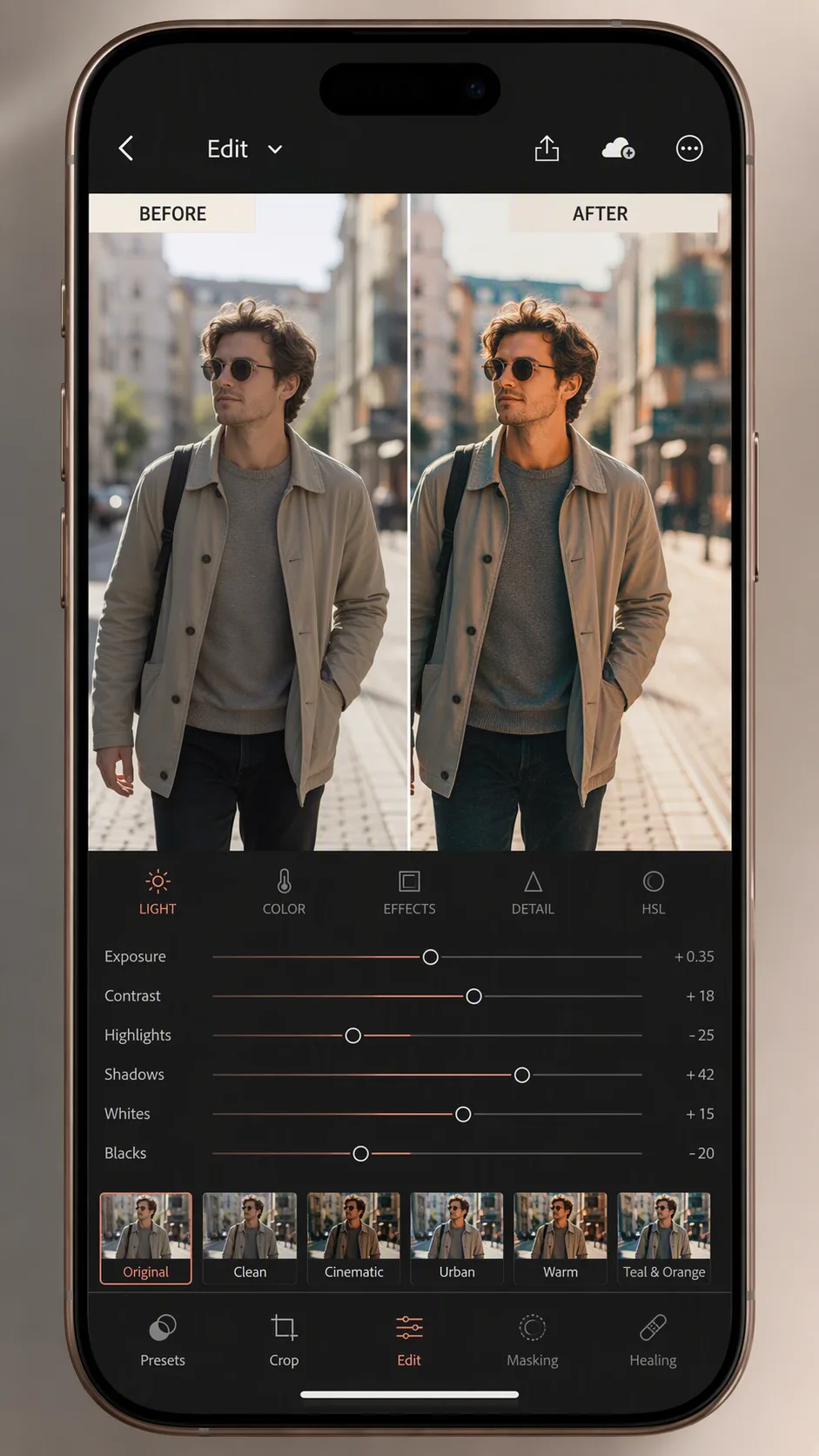
Present a split-screen before-and-after photo editing result as a realistic smartphone app screenshot inside a modern phone mockup. Use the Photo Subject in the same composition on both sides, with the unedited version on the left and the version applying the Editing Result on the right. Place the Comparison Labels clearly above their respective panels, rendering each label exactly as written. Keep the comparison easy to understand at a glance, with a precise vertical divider and consistent crop, scale, and lighting across both images. Show a believable photo-editing interface around the comparison, including a restrained toolbar, adjustment controls, and small thumbnail elements without distracting from the result. Use the Color Palette throughout the interface and phone presentation. Add realistic glass reflections, rounded screen corners, subtle depth, and soft studio lighting on the device. Compose everything in the Format, with crisp UI edges, legible text, and no warped interface elements.

Use these details:
Photo Subject: "a person walking through a sunlit city street with softly blurred buildings behind them"
Editing Result: "warmer skin tones, lifted shadows, richer teal-and-orange contrast, subtle film grain, and a clean editorial finish"
Comparison Labels: ["BEFORE", "AFTER"]
Color Palette: "soft charcoal, warm cream, muted teal, and coral accents"
Format: "9:16 vertical"