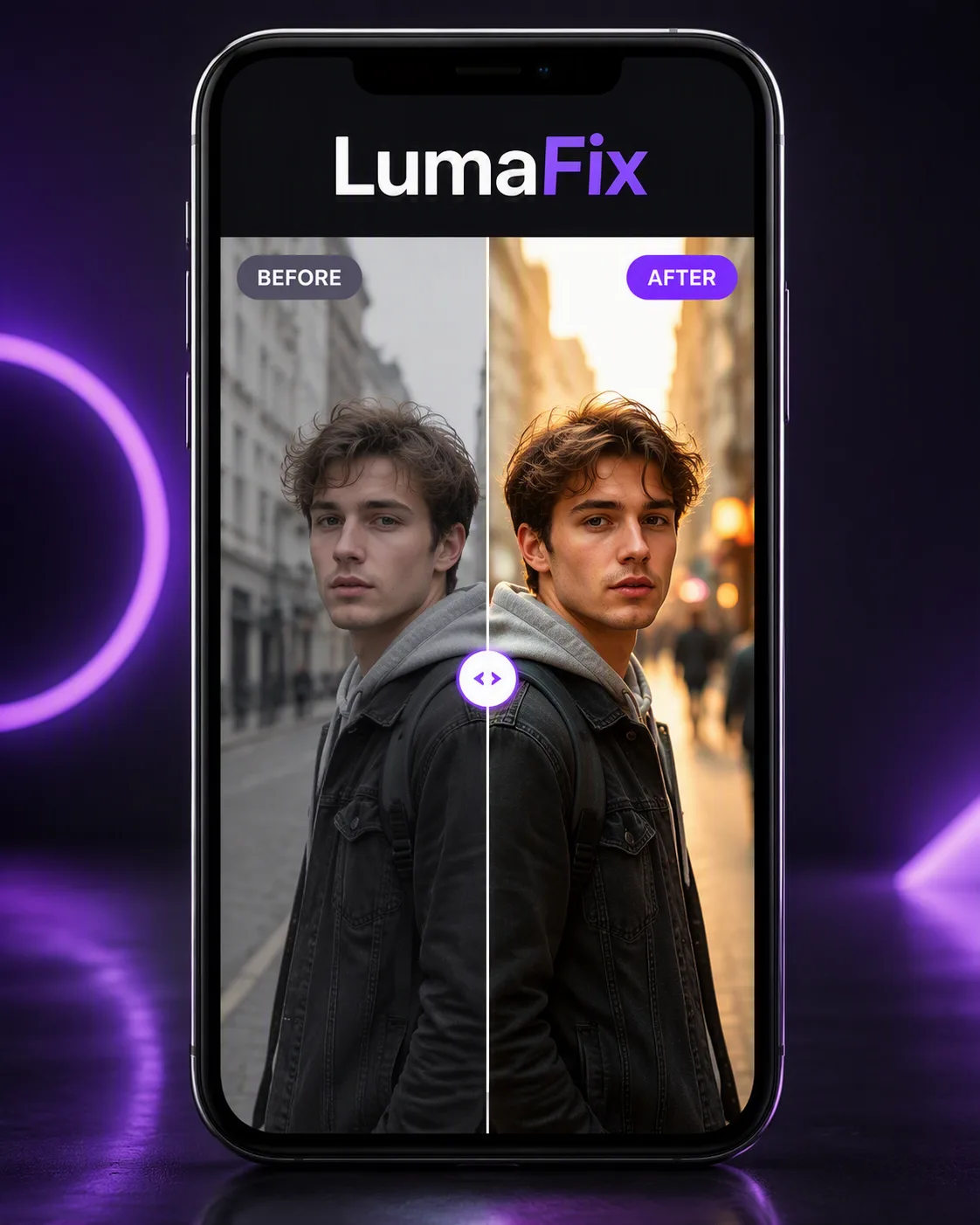
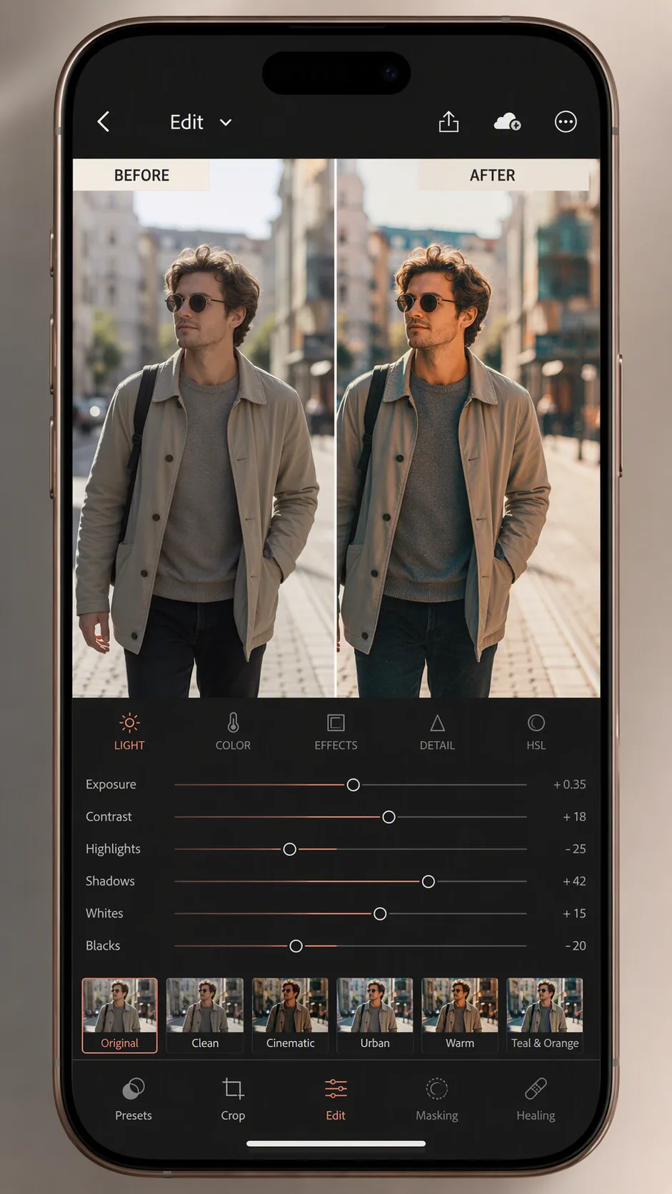
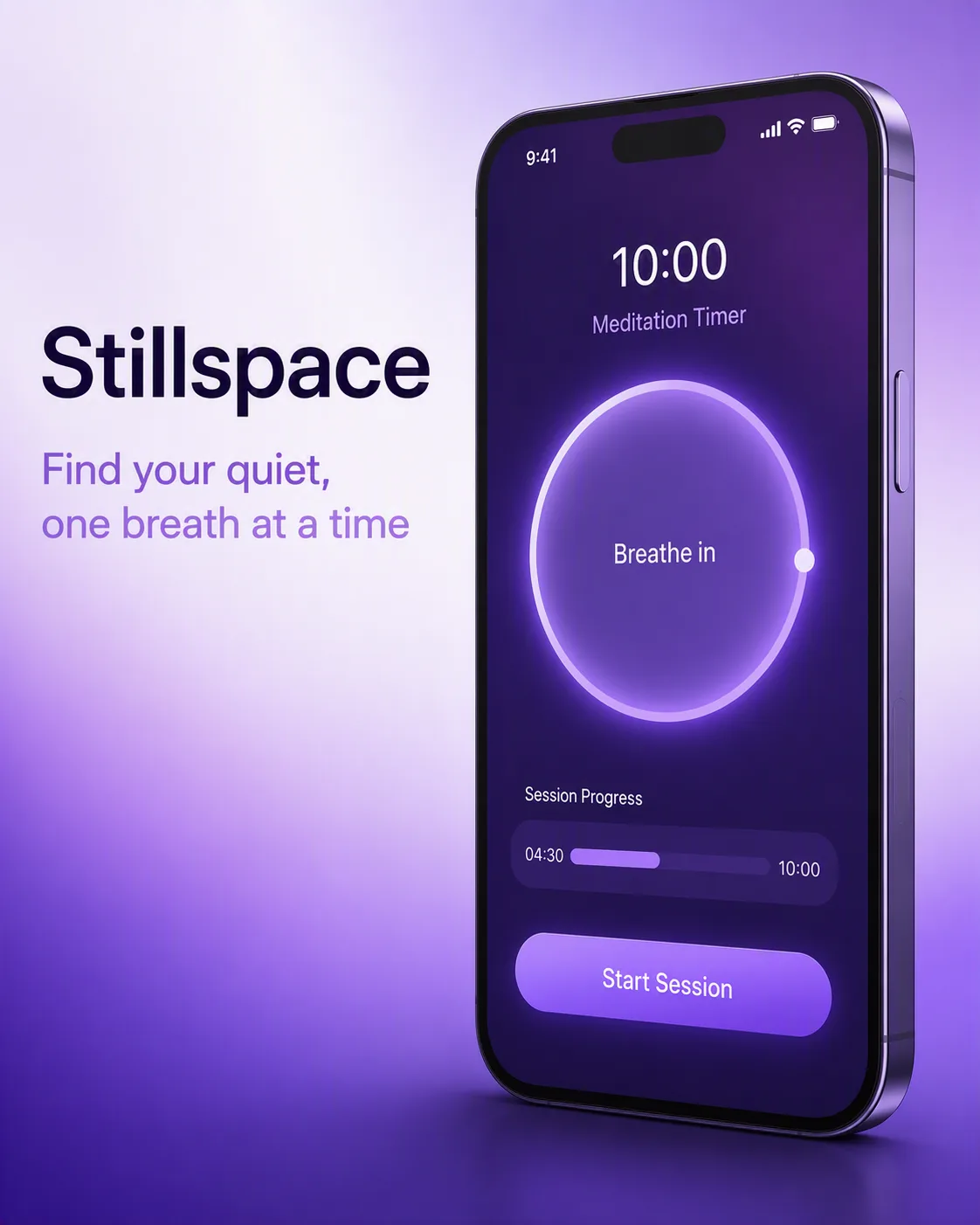
Present a straight-on smartphone mockup as the central subject, with the screen showing a convincing split-screen before-and-after photo editing result. Use the Original Photo on the left and the Edited Photo on the right, aligned to show the same composition and subject with a clear visual improvement. Place the Before Label and After Label directly over their respective halves in clean, highly legible sans-serif type. Put the App Name at the top of the phone interface as the only prominent brand text. Use the Color Palette across the interface accents, labels and surrounding graphic elements. Keep the phone centered against a simple studio background with subtle depth, realistic glass reflections and refined product-ad lighting. Make the comparison easy to understand at a glance, with crisp edges, accurate proportions and no extra unreadable interface text. Compose the final image in the Format.

Use these details:
App Name: "LumaFix"
Original Photo: "a flat, slightly dull street portrait with gray daylight, muted colors and minimal contrast"
Edited Photo: "the same street portrait with warm golden light, richer colors, crisp detail and a softly blurred city background"
Before Label: "BEFORE"
After Label: "AFTER"
Color Palette: "electric violet, soft lavender, white and charcoal"
Format: "4:5 vertical social media ad"