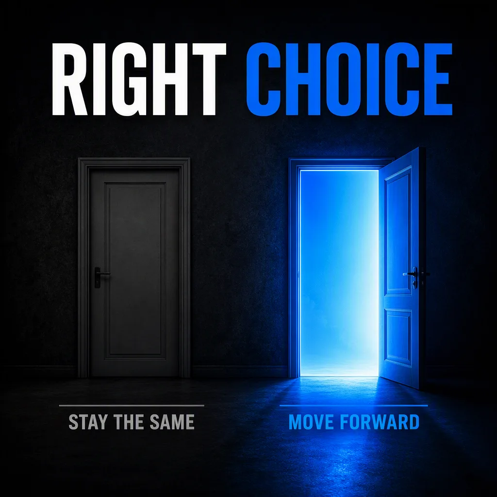
Build a bold LinkedIn graphic around a decisive visual contrast: place the Left Door on the left and the Right Door on the right, both standing side by side in the Background. Keep the left side subdued and nearly swallowed by shadow, while the right doorway casts a vivid blue glow across the floor and surrounding darkness. Use the Color Palette with strong tonal separation, restrained detail and a clean editorial composition. Add the Headline prominently near the top in large, crisp sans-serif lettering. Place the Door Labels beneath their corresponding doors, keeping the wording exactly as written and clearly legible. Leave generous negative space, use balanced symmetry, sharp edges and subtle atmospheric light bloom. The result should feel motivational, modern and suitable for a professional LinkedIn audience, rendered in the Format. Ensure every word is spelled correctly and remains easy to read on a mobile screen.

Use these details:
Headline: "RIGHT CHOICE"
Left Door: "dull gray closed door"
Right Door: "glowing blue open door"
Door Labels: ["STAY THE SAME", "MOVE FORWARD"]
Color Palette: "charcoal black, dull gray, electric blue and white"
Background: "dark shadowy corridor with a subtle textured wall"
Format: "1:1 square LinkedIn post"