Design a square quarterly results graphic for LinkedIn using the Format. Build the composition around the Company Name and Reporting Period, with the Metric Label set in a restrained secondary position and the Key Statistic as the unmistakable visual focal point. Highlight only the Key Statistic with strong scale, generous spacing and the brightest emphasis from the Color Palette. Add the Supporting Copy in smaller, highly legible type. Use the Background across the full canvas and apply the Color Palette consistently to typography, accents and subtle geometric details. Keep the layout minimal, executive and easy to scan, with a clear hierarchy, precise alignment and ample negative space. Render every field exactly as written. Avoid extra statistics, decorative clutter, gradients that reduce readability and misspelled text.

Use these details:
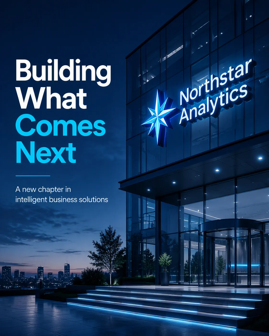
Company Name: "Northstar Analytics"
Reporting Period: "Q3 2025"
Metric Label: "Revenue Growth"
Key Statistic: "+42%"
Supporting Copy: "Strong momentum across new markets and recurring accounts"
Background: "dark charcoal"
Color Palette: "bright green, white and charcoal gray"
Format: "1200 x 1200 LinkedIn post"