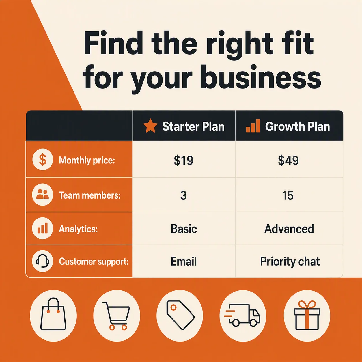
A clear e-commerce feature comparison graphic for LinkedIn, arranged as a balanced square post in the Format. Use the Color Palette for a two-tone background, with a warm orange section and a soft cream section separated by a clean geometric division. Place the Headline prominently near the top in bold, highly legible typography. Build a comparison table beneath it with Product A and Product B as the two column headings, and use the Comparison Rows as the exact comparison content. Add the Shopping Icons in a neat horizontal row near the top or bottom, keeping them simple, consistent and clearly recognizable. Use strong alignment, generous spacing, clear hierarchy and restrained decorative details. Render every text field exactly as written, with no spelling errors, distorted letters or extra copy. Keep the layout readable at thumbnail size and suitable for a business audience.

Use these details:
Headline: "Find the right fit for your business"
Product A: "Starter Plan"
Product B: "Growth Plan"
Comparison Rows: ["Monthly price: $19 | $49", "Team members: 3 | 15", "Analytics: Basic | Advanced", "Customer support: Email | Priority chat"]
Shopping Icons: ["Shopping bag", "Cart", "Price tag", "Delivery truck", "Gift box"]
Color Palette: "burnt orange, soft cream and dark charcoal"
Format: "1200 x 1200 square LinkedIn post"