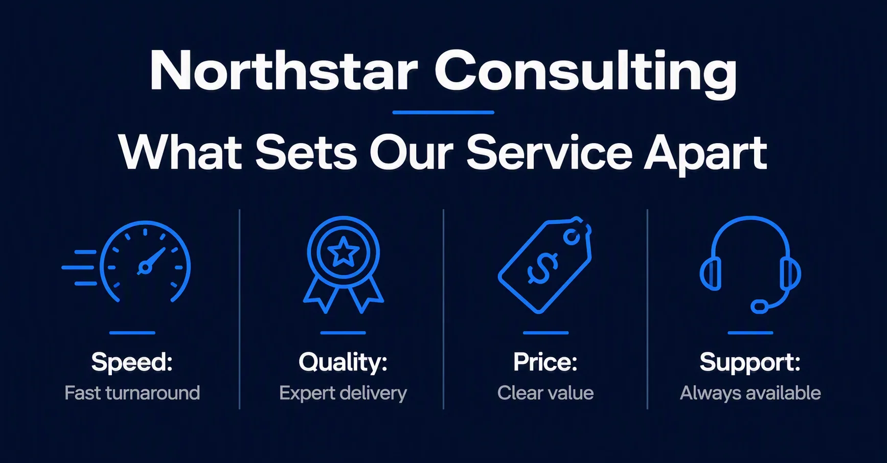
Design a clean LinkedIn post for a service agency using the Agency Name and Headline as the primary text. Build a balanced four-part icon grid from the Comparison Points, with one simple, instantly recognizable line icon per point and the label-value pairing clearly legible beneath it. Use the Color Palette across a solid navy background, keeping the white typography crisp and the electric blue accent reserved for icons, dividers or small highlights. Arrange the grid with generous spacing, consistent alignment and strong visual hierarchy, leaving comfortable margins around every element. Use a modern geometric sans-serif typeface, restrained rounded shapes and subtle contrast between the background and grid elements. Make the design feel organized, trustworthy and suitable for a professional service agency. Render all text exactly as provided, with no extra copy, misspellings or decorative clutter. Output the finished design in the Format.

Use these details:
Agency Name: "Northstar Consulting"
Headline: "What Sets Our Service Apart"
Comparison Points: ["Speed: Fast turnaround", "Quality: Expert delivery", "Price: Clear value", "Support: Always available"]
Color Palette: "dark navy, white, electric blue and soft gray"
Format: "1200 x 627 px LinkedIn post"
AI models never repeat themselves exactly, so your result will differ from the one here. Change the details to make it yours.