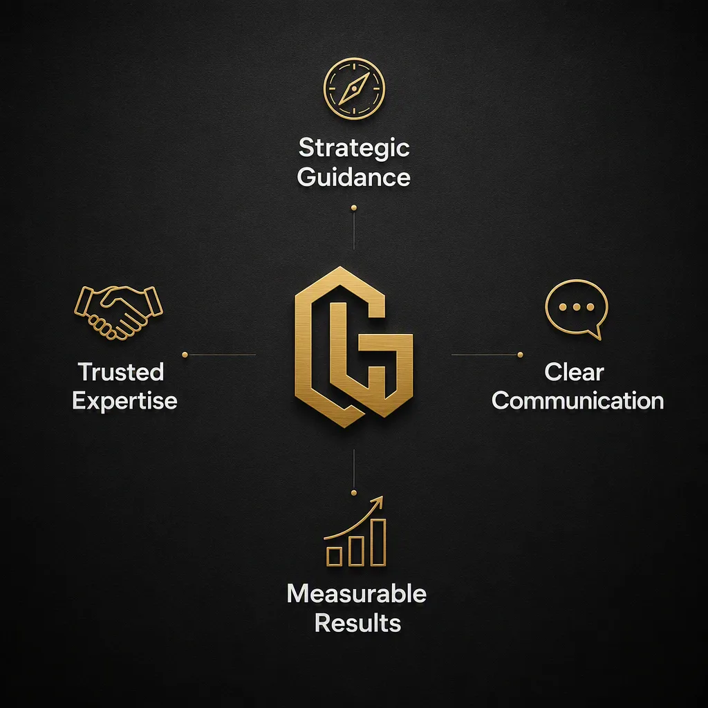
Arrange four concise benefit statements from the Benefit Labels around the Logo Mark at the center, forming a balanced cross-shaped composition for a professional services company. Use a refined, editorial layout on the Background, with each benefit paired with a simple, consistent line icon that clearly suggests its meaning. Apply the Color Palette with strong contrast, using warm white for the main labels, soft gray for supporting details, and muted gold to highlight the icons and central logo. Keep generous negative space, precise alignment, even spacing, and a restrained corporate visual language. Use clean geometric sans-serif typography, making every label highly legible at mobile size. Add subtle depth through fine shadows and restrained texture without clutter. Render the final artwork in the Format. Ensure all Benefit Labels are spelled exactly as provided and avoid extra text, distorted lettering, or uneven icon styles.

Use these details:
Logo Mark: "interlocking gold geometric initials"
Benefit Labels: ["Strategic Guidance", "Trusted Expertise", "Clear Communication", "Measurable Results"]
Background: "matte charcoal with a subtle radial gradient and fine grain texture"
Color Palette: "charcoal, muted gold, warm white and soft gray"
Format: "1:1 square Instagram post"