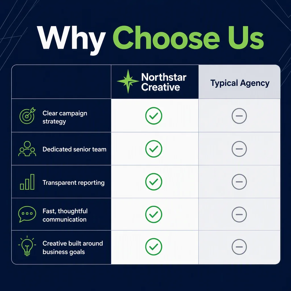
Design a confident LinkedIn comparison post using the Format. Place the Headline prominently at the top in bold, modern sans-serif type, with strong hierarchy and generous spacing. Build a clean two-column comparison layout beneath it, with Agency Name and Alternative Label as the column labels. Use the Comparison Points as individual rows, placing a clear green checkmark beside every row in the Agency Name column and a restrained neutral symbol in the Alternative Label column. Use the Color Palette consistently across the background, typography, dividers and checkmarks. Keep the composition centered, spacious and easy to scan on mobile, with crisp alignment and strong contrast. Add subtle geometric structure or fine lines for visual polish without distracting from the checklist. Render all supplied text exactly as written, with accurate spelling and no extra copy. Avoid clutter, tiny text, decorative illustrations and uneven spacing.

Use these details:
Headline: "Why Choose Us"
Agency Name: "Northstar Creative"
Alternative Label: "Typical Agency"
Comparison Points: ["Clear campaign strategy", "Dedicated senior team", "Transparent reporting", "Fast, thoughtful communication", "Creative built around business goals"]
Color Palette: "dark navy, fresh green, white and cool gray"
Format: "1200 x 627 pixel LinkedIn post"